Blackboard Redesign
Blackboard is a learning management system used in many of the schools in the United States. Professors and students alike interact with the software daily; professors use the desktop app version & students use the mobile app version. With no other competitor on the horizon, Blackboard controls the majority of the market all by itself, seeing no need to better the experience for students. I seek to change that.
THE BIG PICTURE
AS A STUDENT
A student only needs to know a few things every day to know they are on track to succeed that semester. Routinely check grades, look at the syllabus to know what is coming next week, and see PDFs if the current assignments are a top priority.
Students are always on their phones; they are rarely seen without it; thus, making these changes may not significantly change a student's life but will get rid of small details that bother them daily. Students enrolled at CSUEB couldn’t access these things when using the Blackboard mobile app. You either have to go to the library, use the computers or open your laptop to check what you need.
MY ROLE
Since I was a team of one for this project, I handled everything myself, from user interviews to high-fidelity prototypes.
I led the effort to evolve the Blackboard mobile app and address the student pain points related to a lot of the non-sense the app is filled with
CUSTOMER INSIGHTS & IDEATION
I partnered with three professors and eleven students to uncover insights and translate concepts into features that would address students' wants and needs.
EXPERIENCE STRATEGY & VISION
I created frameworks and prototypes to share the vision, design principles, and content strategy.
PLANNING & SCOPE DEFINITION
I defined the product with my project manager partners. I prioritized features for launch and beyond.
DESIGN EXECUTION & VALIDATION
I executed journeys, wireframes, prototypes, and design specs.
LEADERSHIP
I designed up and presented the work to my professor and classmates, and ultimately I showed my presentation to the Art Department Chair.
THE CHALLENGE
MAKE STUDENTS LOVE THE NOW DISLIKED BLACKBOARD APP
It’s common knowledge that the Blackboard app sucks, you just have to ask any student on campus, and they will tell you why; it's just hard to use and confusing. Many features are not even used that further add to the app's complexity. Students are not alone; professors and staff who use the app don’t like it either. It is here where students and school faculty have reached a consensus.
My challenge is to change how students see the Blackboard app. They should be happy that they are using the app and not grunt at having to.
I hope to create a deeper relationship with the student through the revamped version of Blackboard.
LIFTOFF
THE APPROACH
To help with the redesign of the Blackboard app, I had to reach out to my peers and my instructors. I conducted Interviews with three professors and 11 classmates to hear what they have to say about their experience when using the app. I went around two departments, English and Art, to get a better overall view of each student experience.
Questions (Students)
What are the main reasons you use the Blackboard mobile app?
Is there anything you check consistently? If so, what is it?
Where do you keep everything you need to stay organized for in class.
Would you recommend the Blackboard app to other students?
What do you like about the Blackboard app?
What do you dislike about it?
If you could change anything about the app, what would it be?
Questions (Teachers)
Why does the school use Blackboard?
Do you enjoy using Blackboard?
Have you seen the student version of Blackboard and not the instructor view?
Are you aware of student sentiment in regards to using Blackboard?
What are things you would change if you could?
ONE GOOGLE SEARCH
Have you ever googled, “why does blackboard suck?” no? Here let me show you what pops up.
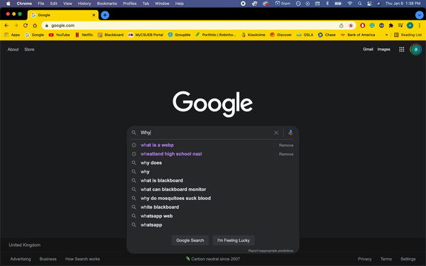
I wasn't aware that there were articles and blog posts about Blackboard and its usability; students and teachers turned to the internet to vent their frustrations. It seems that it’s “academic software hell” on the teachers' side and not just the students.
THE DISCOVERY
STUDENT & TEACHER INSIGHTS
I conducted student and general research to drive the revamping phase. These are the key insights that will define the final version of the Blackboard redesign.

CHECKING SYLLABUS
Multiple students stated in their interviews that they check their syllabuses weekly, if not daily, because teachers always say, “it's on the syllabus.”

VIEWING GPA
Students have to log into the universities portal to view their overall GPA. GPA should be displayed automatically on the home screen.

KNOWING CLASS GRADE
Class grades can change as soon as a new assignment is scored, student log into blackboard simply to check their grade.

UPCOMING ASSIGNMENTS
Assignments should be displayed and not hidden under folders.
STUDENT JOURNEY MAP

The map displays a student's confidence level as they try to complete the most common tasks. A student's overall confidence level isn’t high from the start; as the student progresses, we can see the decline.
SITE MAP
Creating a sitemap helped with distinguishing the hierarchy within the application. Instead of jumping right into the digital phase of the project, drawing the diagram of how the user would interact with the application made it easier to visualize a flow.

THE DESIGN
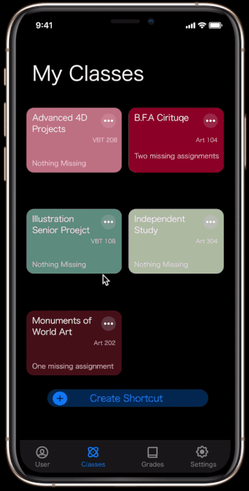
INTRODUCING BLACKBOARD REDESIGN
Students indicated the experience they get while using the app is subpar, something has to be done, so I listened to the student’s concerns and based my design solely on their request. Listening to students made the redesign of the app not difficult; removing the non-essential sections of the app left space for what's utilized daily by students.

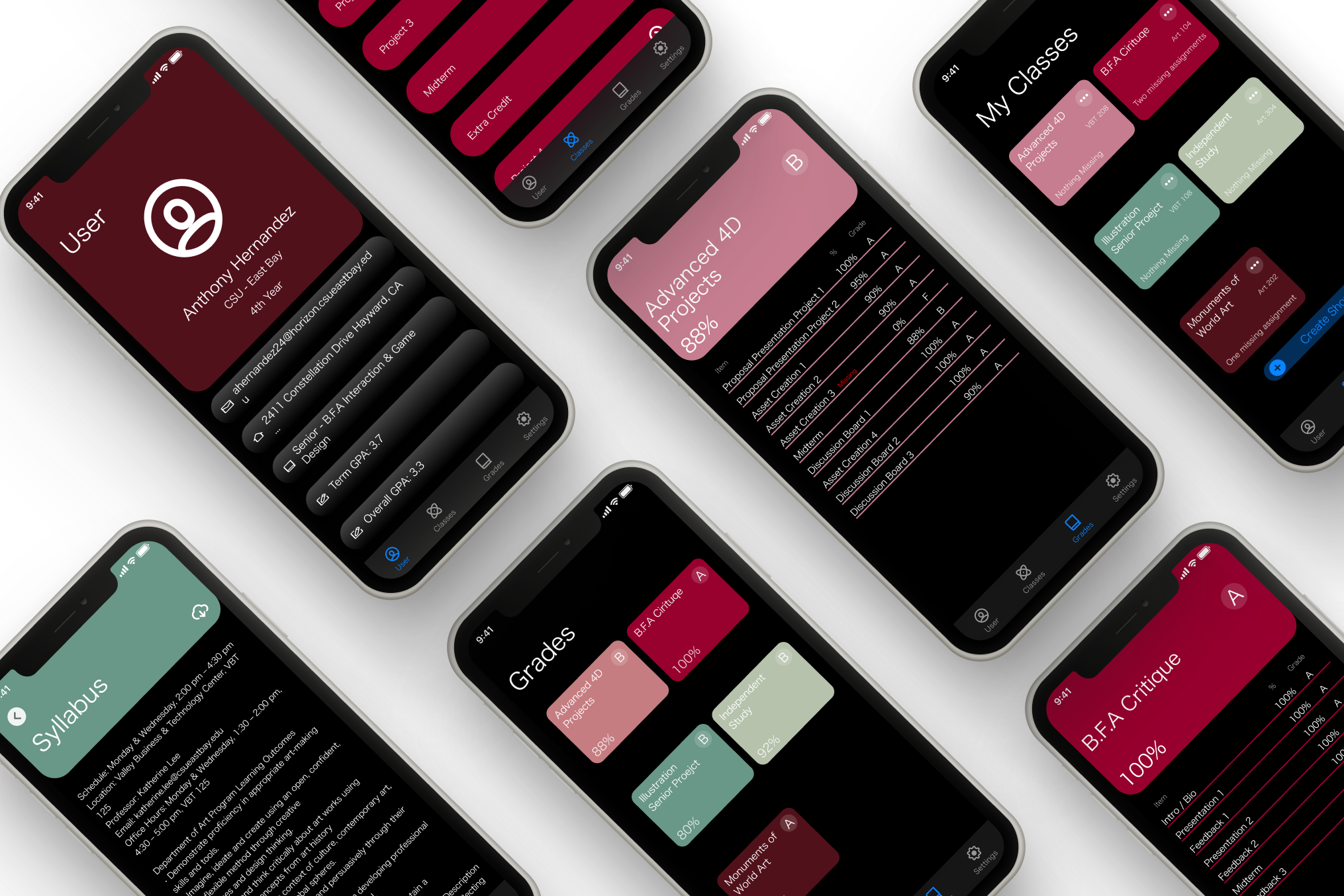
QUICKLY SEEING WHAT’S IMPORTANT
Term GPA & Overall GPA is now easily accessible to students and their respective advisors’ names. Students will no longer waste time looking for their most requested information.

CONTENT AT THE CLICK OF A BUTTON
Accessing the class syllabus and course materials is only three clicks away. Leaving what is necessary for a student to succeed on screen.
INTUITIVELY DISPLAYED GRADES
Grades are only two clicks away, paired with a comprehensive breakdown of each assignment graded that counts towards the overall class grade.
HOW WE GOT HERE
GIVING STUDENTS WHAT THEY NEED
I made low-fidelity wireframes of the main components that will be used to create and envision the application’s interface. My partner drew the illustrations to focus on the onboarding process, importing a calendar, and lastly, the estimator aspect of the application.
I focused on class sections, grades & classes, course materials, settings, student profiles, and syllabi.
LOW-FIDELITY WIREFRAMES
CHECK OUT THE REDESIGN
feel free to interact with the prototype below.
THE IMPACT
IT’S JUST THE START
The Blackboard redesign app has received positive and negative feedback since the app presentation. Students responded well to all the app’s features and the simplistic redesign. I was asked repeatedly why this prototype couldn’t be the one they were using. Unfortunately, negative feedback broadly relates to the lack of file upload capability — this issue wasn’t brought up during the student interviews.