First-Time First-Year Student Portal
In the early 2000’s California State University East Bay enjoyed a steady enrollment of students that increased each year. By the start of 2015, the constant influx of students started to decrease due to an outdated information structure and unthoughtful information pathways that didn’t take the student in mind.
I was part of a small team entrusted with designing the high school to university student experience for one of the most promising up-and-coming universities in the Bay Area.
To comply with my non-disclosure agreement, I have omitted and obfuscated confidential information in this case study. All information in this case study is my own and does not necessarily reflect CSUEB.

PERFECTING THE TRANSITION
CSUEB’s website design in 2015 struggled to scale alongside the university’s growth, and in 2020, it reached its tipping point. The University challenged basic usability. The accretion of information brought on by staff, new clubs, and buildings competed for focus. Website reliability and performance issues increased exponentially.
Prospective students have been turned away because of subpar Webdesign, leading to a potential loss of $27,000 per student per year. Due to the lack of in-person interaction in the current pandemic world, the university website has become more crucial in the present state of the world than ever. According to our findings, in fall 2020, there was a 23% decline in first-year student registration.
Finding the correct information quickly and effortlessly has become a top priority.
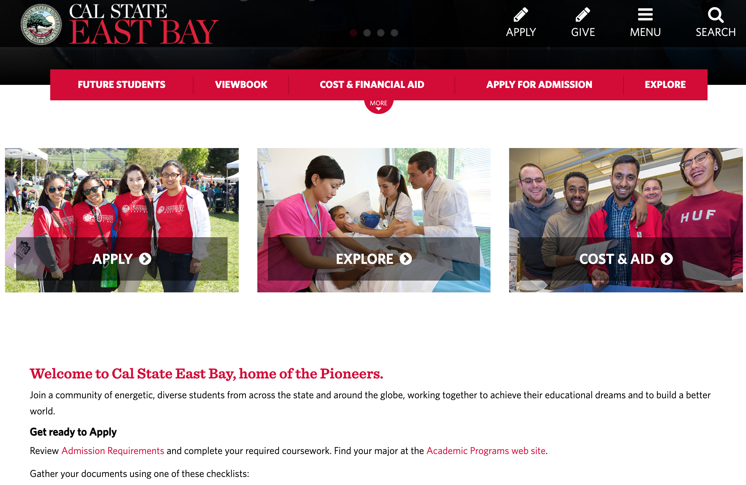
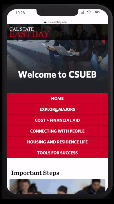
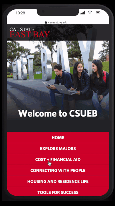
The previous user interface students dealt with from 2015 - 2020
THE CHALLENGE
INCREASE STUDENT ENROLLMENT IN 10 MONTHS
Our goal for the project is to regain the steady growth of students and have it be consistent year over year. The premise was simple: a student is interested in enrolling in CSUEB; it shouldn’t take any more than three clicks to find the information needed. Our ambition is to create a layout that embraced the test of time and the revolving door that is university information and a more diverse user base.
Our high-level goals are to:
Make it simple for students to find the exact information they need in their first year.
Give unique user flows for the first time, second, and subsequent student users.
Create a layout that allows and changes when current information becomes outdated and new staff has to update it.
MY ROLE
I led the design of the student portal between June 2020 and May 2021 and collaborated with one other designer at the start of November 2020 on the Style guide stakeholder presentations.
In addition, I worked alongside a Product Manager.
I stopped working on the project during the production phase as the app started to be built and my contract ended.
The portal launched globally on September 2nd, 2021.
LIFTOFF
STARTING FROM THE BOTTOM
At the start of the project, we were presented with the iceberg; what was visible was only the tip. Without pre-existing insights, my first task was evaluating the whole first-year experience from an interaction point of view.
Questions like, “what would a student see and click through when they are thinking or deciding to apply to university.”
NIELSEN HEURISTICS
I conducted a heuristic evaluation on the pages that incoming first-year students would interact with. The goal here was to understand pain points that a student would come in contact with while looking for information or applying.


Feel free to click through the heuristic presentation below.
The time and energy spent navigating the site looking for what you needed had a material impact on the business bottom line. Waiting time translates directly into website under-utilization, and every student lost costs the school.
In a city like Hayward, the surrounding area is gaining popularity and has an influx of students. Tuition prices keep on rising year after year. The website's inefficiency contributes to first-year students’ high dropout rate, leading to a potential revenue loss ($27k/student /yr).
Drop-Out Rate
Revenue Lost
I have intentionally omitted confidential data here.
EARLY INSIGHTS FROM THE FIELD
With the help of the university dean, I was able to get in contact with 19 students who had just started their first year not so long ago. Interviewing these students was critical because their recent experience of applying and looking for information would provide valuable insights.
The names of the interviewees are omitted to comply with IRB regulations.

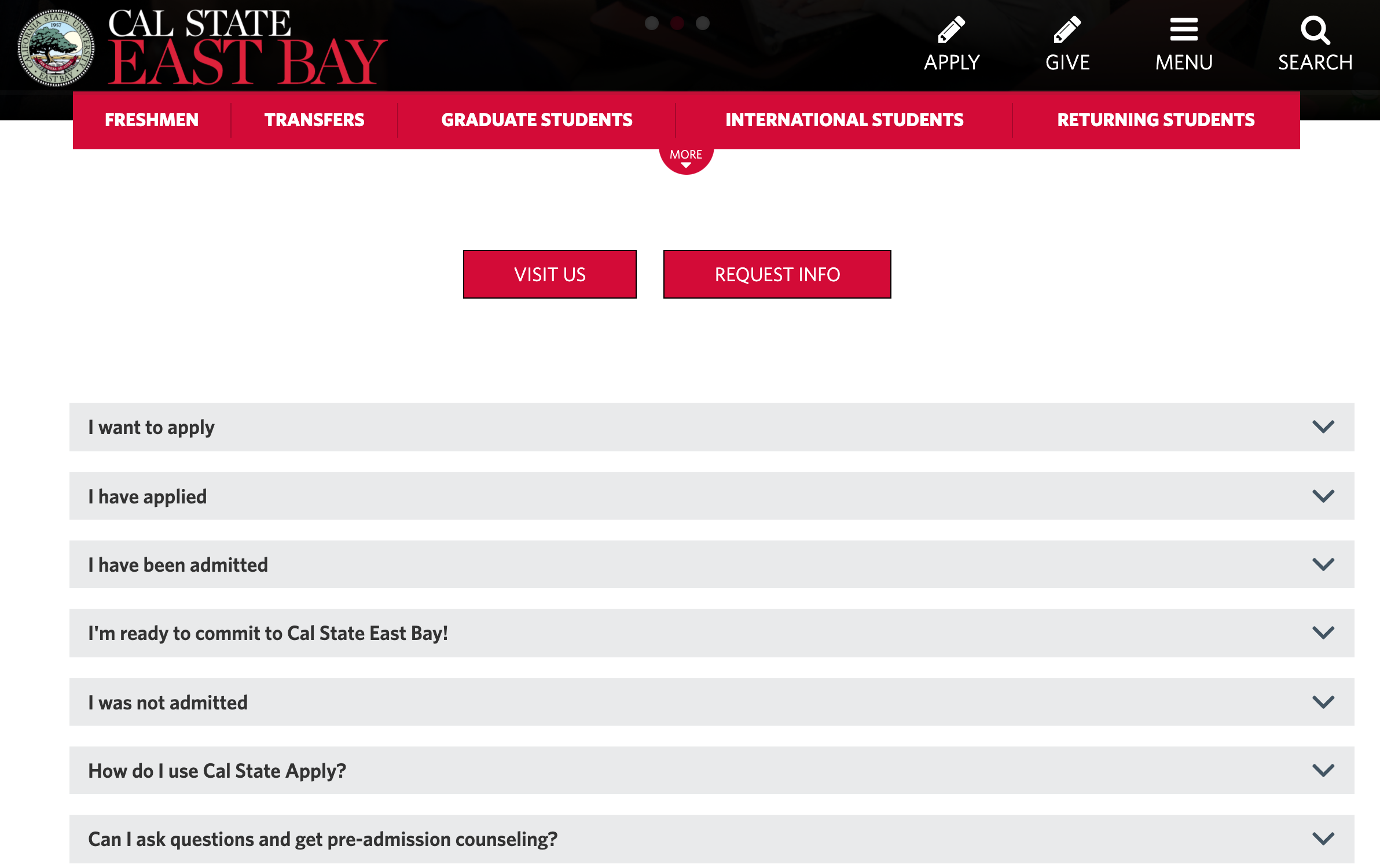
THE SITE WAS CHOPPY & IT DIFFICULT TO FIND INFORMATION
Often new students find it challenging to find the information they are looking for because the layout is unique. However, the website should be structured so that information is easy to find for new students.

LACK OF INFORMATION ON THE ART DEPARTMENT
Universities have to keep their department’s information up to date. The cause could be human error, or the site had broken data sections due to an accumulation of outdated information.

PRESENTED WITH INFORMATION THAT DIDN’T MATCH STUDENT’S INTEREST
Placement on university websites are important for the reason that many students, teachers, and families use it for reference. Ensuring the correct information is where it’s supposed to should be of top priority.

SPEND A LOT OF TIME TO FIND WHAT THEY WERE LOOKING FOR
It’s not enough to just place the information under the correct department. The University should take the style and hierarchical placement of the data into account, so time is not wasted looking for the info.
THE DISCOVERY
IT’S DIFFICULT FOR STUDENTS TO FIND WHAT THEY ARE LOOKING FOR
I was surprised by the issues we found. It felt as if no one was taking the students into account; the current status quo was putting relevant information somewhere on the site and hoping the corresponding student found it. The problem faced was simple; it was more of an organizational pathway problem than anything else. It also became clear that students expected to see all the questions regarding first-year students with minimal effort.
“The initiative allowed us to perfect the enrollment process for all CSUEB students to come.”
DEEPER INSIGHTS
USING DATA TO REACH PERFECTION
Before I could jump into designing, it was necessary to define success and understand the current health of the student enrollment experience at scale.
Before the redesign, I contacted the university dean to get in contact with university GE advisors and high-school counselors from the surrounding areas.
I reached out to 8 GE advisors and 27 High-School Counselors to better identify where students usually get stuck and how advisors use website information to help students.
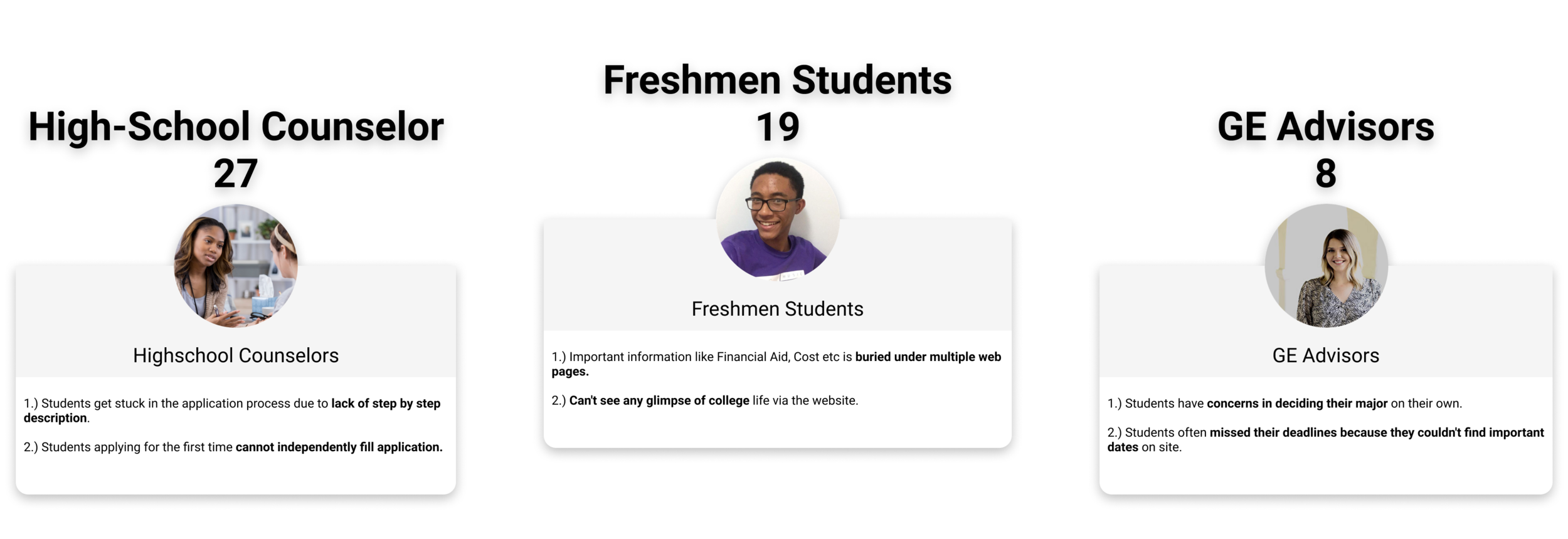
Expanding our interview made it possible to understand the student in three stages of the process. It starts with high-school counselors, where students go to their first questions about universities. The student then continues the search on his own time, searching independently. In the end, GE Advisors advise students in more detail.
BENCHMARKING THE COMPETITION
Digging into the data revealed some significant insights into the first-year student search experience. The data showed that other schools had streamlined student pathways. Almost all universities we looked at involved an easy-to-understand and straightforward navigational interface that required minimal effort to find what you were looking for; the need to re-circle the site for information was non-existent.
I conducted a competitive analysis of ASU and UC Davis’s website to understand what these schools were doing to help and retain first-year students. We found that both the schools have:

TAILOR-MADE FOR SOMEONE INTERESTED IN APPLYING
Website design is based on a path journey-driven approach.
Easy access to application information.

CLEAR HEADER WITH NO FLUFF
Intuitive website navigation
Quick access to university resources.
UC Davis has a clean landing page and header. While it may seem that there’s a small amount of information on the page, the sole focus is to put what is necessary. ASU does a fantastic job at giving students actual pathways relevant to their current student status.
WHAT THE DATA TELLS US
With the help of the engineers, we were able to get google analytics data for the top 10 pages that CSUEB first-year students visit each year. I decided that this was a key metric to look into so that we are aware of our current standing with the website that’s currently live.
Feel free to navigate through the below.
The broken links, high-bounce rates, and time spent on pages exacerbate the difficult journey between first-year students and the information they need.
The insights we discovered are:
Finding critical information like Cost, Financial Aid, Finding Major takes 4-7 clicks.
Some of the web pages have broken links & dead ends.
Despite being the most crucial page, the average time spent on application pages is 1:29 min.
Most of the site traffic is via google search instead of internal site search.
THE JOURNEY
With our feet well in the dirt, we conducted contextual interviews of first-year students to gather insight on how they interact with the website and designed a journey map that focuses on their experience. Make sure we visualize all touchpoints between students and the website.
The names of the interviewees are omitted to comply with IRB regulations.

Observations:
Students are not confident in filling the application
Unsure about future growth and job prospects of opted major.
Career assessment tools are missing to explore majors.
The website is text-heavy.
Unable to connect with clubs /organizations align with my interest.
Students get stuck in the application process.
There is Difficulty in finding the cost and Financial Aid information.
REFRAMING THE PROBLEM
OUTDATED/UNMANAGED INFORMATION PAIRED WITH NON-RESPONSIVE LAYOUTS CAUSED AN ARRAY OF PROBLEMS DOWNSTREAM FOR STUDENTS.
The current design of the CSUEB website meant for first-year students augments the average time it takes for said information to be located. Through our extensive interviews, journey maps, competitive analysis, and google analytics, only a tiny percentage of students can find the information they are looking for. The additional effort required from students, counselors, and advisors leads to frustration and wasted time.
“...How might we help Students & Universities form a better pathway for students to find information effortlessly? ”
This begged the question, how might we help students find the information they are looking for much faster, and how can we aid CSUEB in offering this help? Our proposal was a First-Time First-Year Student Portal, a portal created on behalf of students by students.
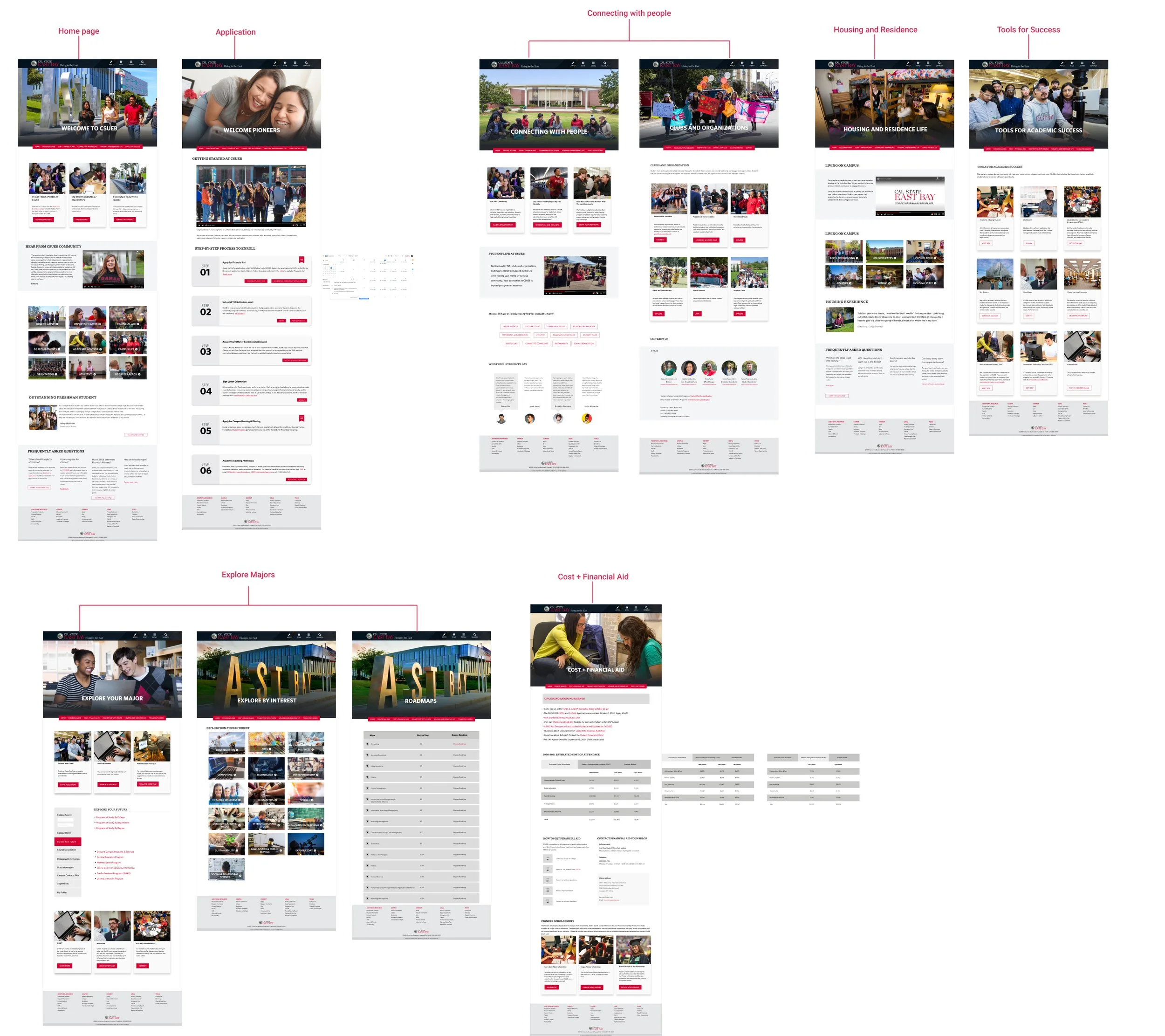
PATHWAY REDESIGN
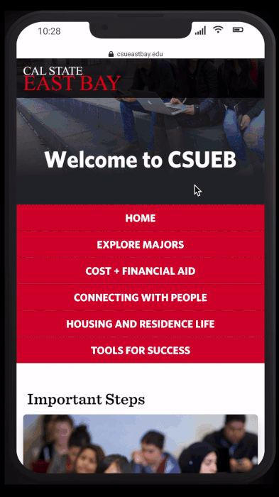
INTRODUCING FIRST-TIME FIRST-YEAR STUDENT PORTAL
In an age where the newer generations are finding everything with little to no effort, First-Time First-Year Student Portal gives students back their time by presenting to them all the information they will need for their first year all in one place. Informing the students in carefully thought-out ways is what the team has made possible with custom-curated user pathways.
For the following sections, the acronym “FTFP” stands for “First-Time First-Year Student Portal”.
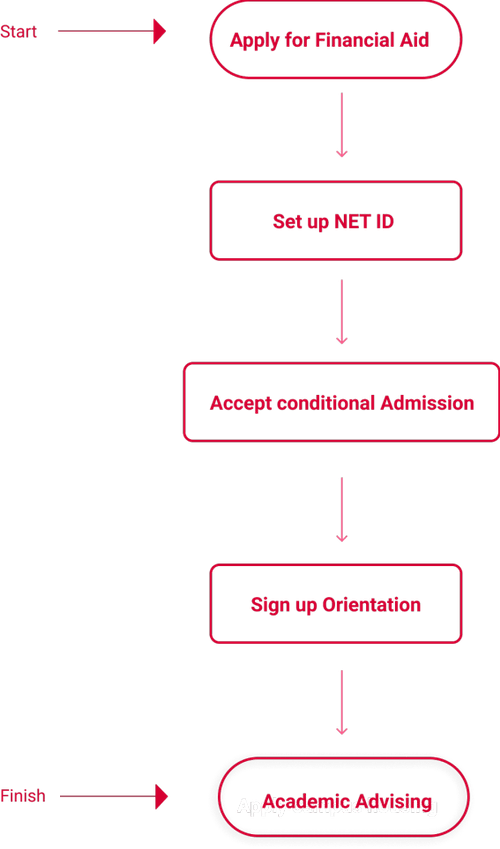
THINK ABOUT ENROLLING, AND WE’LL SHOW YOU THE STEPS
FTFP places the information you are most likely to need in the most optimal place based on your current enrollment status. FTFP preserves your time without having you search endlessly.
Student-friendly scrolling that puts the numerous essential pieces of information at the top helps you identify specific student-driven pathways.
Concept design & motion by me.
WE’VE GOT YOUR BACK WHEN CHOOSING A MAJOR
When the student isn’t sure about what major they want to choose, they’ll be prompted to “Search by Interest,” where you can search for interests such as art, construction, business, technology, humanities, and sustainability. A list of majors that fall under your specific interest will then be shown.
Concept design & motion by me.
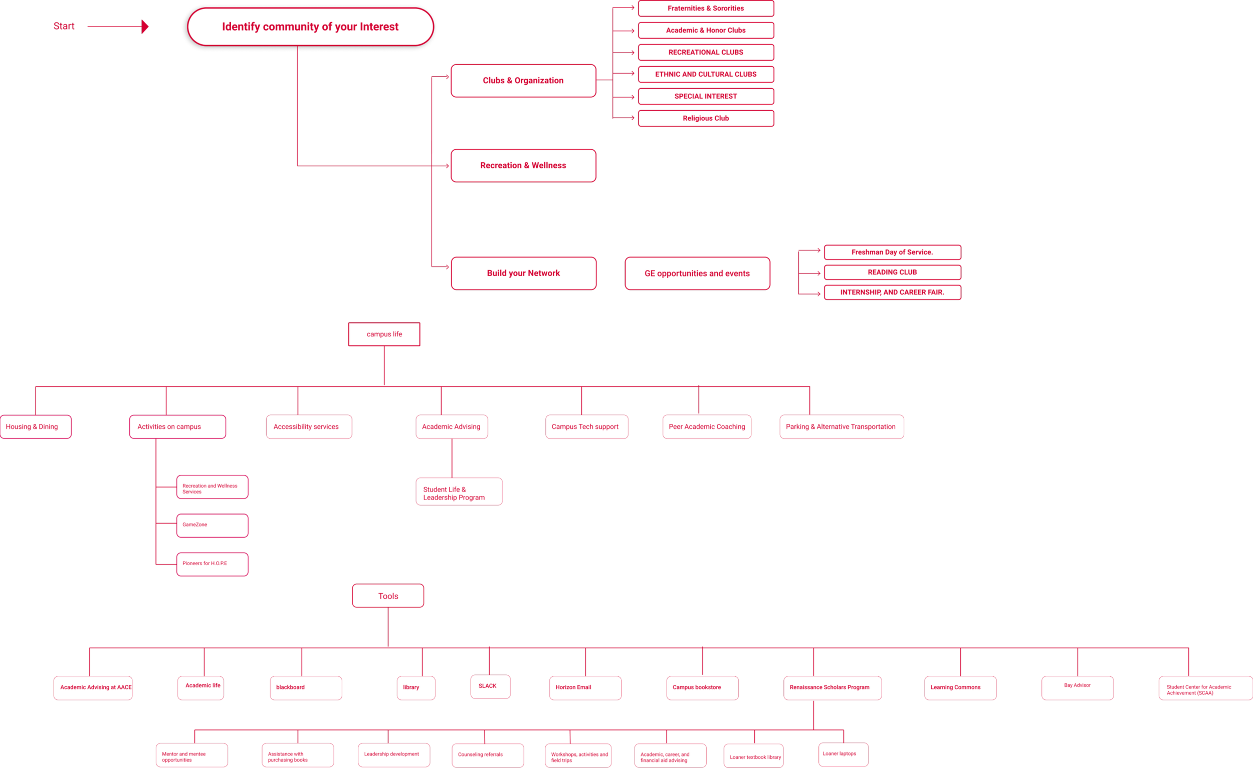
FORM CONSTANT CONNECTIONS
Knowing how and where to make connections is only one click away. FTFP understands the importance of forming relationships during your first years and gives you the option at the click of a button.
Concept design & motion by me.
FINANCIAL AID & SCHOLARSHIP ALL IN ONE PLACE
often many students’ financial situations are different. Some are graduate students, WUE (western undergraduate exchange), and international students. We’ve provided additional filters that show estimated tuition if you live with parents, off-campus, or dormitories.

Concept design & motion by me.
OUR PATH TO GETTING THERE
PERFECTING THE TRANSITION FOR STUDENTS EVERYWHERE
Three primary questions informed my design strategy:
What’s the perfect enrollment process?
How do you design for every student's needs?
How do you give the website a new look without changing its familiarity?
It was essential to understand the different factors influencing the student enrollment experience. I mapped and analyzed the current navigation path followed by first-year students. I then categorized the web pages into four categories; existing pages, external pages, pages needing a redesign, and new pages in the future.

INCLUSIVE DESIGN
A student’s existing pathways are poorly designed for first-time first-year students who aren’t reflections of 2015. Moving beyond the current status quo, I tried to educate the stakeholders and team on why this design with a new approach would work for everyone, students and staff alike.
To design a pathway-driven student web portal that provides an intuitive and streamlined experience we had to meet the following goals:
• Find information in minimum clicks.
• Easy engagement within CSUEB Community.
• Find actual dates and deadlines easily.
• Independent application process.
• Easy access to web pages for helping students for gaining insight on career roadmap.
LIMITATIONS
CSUEB website is made in cascade, so an additional challenge was to design a solution that would be easy to integrate with the existing website framework and ready to launch in May 2021.
The existing framework is for the webpages student visit

PROPOSED USER FLOW
We designed a pathway-driven web experience for students interacting with the portal for the first time, the second time, third and subsequent times.
First-time users focus on "getting started" with their applications. The second time users focus on "registering for classes," and the third time, users focus on "how to pay," The subsequent time, users concentrate on finding information on connecting with the CSUEB community and resources available on campus.
First Time User

Second Time User

Third Time User
Subsequent User
VISUAL DESIGN
We used the existing design guide for colors, framework, spacing, and font choice. We designed new cards and buttons to separate the critical information from the rest of the website to make the website exciting and engaging for first-year students.

WIREFRAMING
After designing and testing the user flow patterns, the next challenge was to design easy-to-integrate web pages. We created wireframes of the relevant web pages of the website as per the findings of the user research phase.
LOW FIDELITY

HIGH FIDELITY
OLD VS. NEW

CHECK OUT THE NEW PORTAL
feel free to interact with the prototype below.
THE IMPACT
POSITIVE RESULTS & THINGS TO WORK ON
The creation of the First-Time First-Year Student Portal has had a positive impact on the enrollment process of current and future first-year students at CSUEB. At the time of writing (10 months since launch), I gave the portal a test run with the winter quarter enrollment, the feedback that was received was nothing but positive. However, one thing did change about the portal; only current students can log in. Students that have accepted the admissions letter will have access to the portal, while others who don’t or are looking to apply won’t. I believe this to be an internal issue waiting to be solved.
STUDENT ENROLLMENT INCREASED 19% AFTER LAUNCH
FTFP SUPPORTS CURRENT & FUTURE STUDENTS
PORTAL IS RECOMMENDED BY COUNSELORS TO INCOMING STUDENTS
STUDENTS USE THE PORTAL DAILY FOR THEIR FIRST SEMESTER
For confidentiality reasons I have omitted the actual values for these metrics.